February 14, 2024
Best Course Platform: ThriveCart Learn+ Review

ThriveCart Learn+ Review: The best course platform
Hosting my digital products on ThriveCart Learn+
I’ve used a handful of different solutions to create, host, and sell digital products online. I’ve also worked within the backend of even more learning management platforms while helping clients sell digital products too. Finally, after years of flip flopping, I’ve settled on ThriveCart Learn+ to host my digital product shop and am so happy with the migration. I truly think it’s the best course platform for digital product sellers, especially if you’re new to this world and want something simple, fairly priced, and easy for customers to use.
This video gives you a tour of the backend of one of my digital products so you can see what ThriveCart Learn+ looks like for both a course or digital product creator, and as a customer. If it weren’t clear, I think ThriveCart Learn+ is the best course platform, and definitely the best option for new creators who want a simple, easy solution to sell their digital products.
New video update as of September 2025:
Switching from Thinkific to ThriveCart Learn+
I started selling digital products as part of my business model years ago, and have tried multiple different solutions for selling, delivering, and hosting my digital products. From simple PDF links hidden behind a paywall, to a robust dashboard I built from scratch in Thinkific, to now finally settling on ThriveCart Learn+ and feeling confident in this decision.
Today I want to give you a tour of my ThriveCart Learn+ dashboard so you can actually see things like what it looks like on the backend and how I organize my digital products. And get an honest review of the platform. There’s no surprise that I love using ThriveCart Learn+, but let’s get into the tour so you can see why.
I filmed a video of my honest reactions when I first started migrating my digital product shop from Thinkific to ThriveCart Learn+. You can watch that here.
If you’re just starting to explore how to sell digital products online, I recommend you start here. This blog post talks about how to create a digital product to sell, and it links to part 2 about how to setup a digital product to sell.
Switching to ThriveCart Learn+ didn’t take long
I started and finished this product in just a couple days of work. Yes, I could have asked my team for help. But honestly? I wanted to do this on my own. It was a great opportunity to reconnect with the content inside each of my digital products, and I found multiple places where I could improve the customer experience or the product itself.
Of course, this was a bigger time investment to switch everything over, but I look at it like a win-win because I learned and implemented a new platform I can now recommend to others, and reconnected to the products. Many of those improvements have already been made, which is a bonus. I wanted these to happen ASAP!
Migrating from another course host platform to ThriveCart Learn+
If you’re considering moving your digital products from another course platform to ThriveCart Learn+, I know that can be a daunting project to start on. So here’s a few things to consider to make the project go smoother for you…
Digital product structure and organization: How do you want each digital product or online course to be presented? While ThriveCart Learn+ is very similar to other platforms, you may need to make tweaks.
Customer or student dashboard view: What do you want the login page, main dashboard, and course dashboard to look like for your customers? Again, this is similar to other options, but you will need to make some decisions.
Individual lesson formatting: Because ThriveCart Learn+ doesn’t natively host videos in the platform, you need to consider where you’ll upload your videos (to later embed via code), and what those thumbnails will look like for the videos inside each lesson. Also things like next lesson buttons, text formatting, links to additional resources, and more.
Build a template to start
My best advice if you’re migrating like I did is to build a template for how you want everything to appear, then duplicate this for all of your digital products that need to move over. It of course meant there would be some setup time that didn’t feel like progress (because nothing had moved), but then things went quickly!
Enough about how to migrate and digital product setup details though. Let’s get into my honest review of ThriveCart Learn+ as the best course platform. I’ll also show you what my digital product shop looks like for customers.

My honest ThriveCart Learn+ Review as the best course platform
If it weren’t clear yet, I love ThriveCart Learn+. I mentioned that I’ve used a lot of different course platforms. I personally used Thinkific for years. Clients have used Kajabi, which means I’m familiar with that backend as well. I’ve experienced Podia and Teachable as a digital product customer and course student. I’ve also sold and purchased digital products that are just links to Google Docs, downloads sent via email, and other (kind of hacky) solutions. I’ll say it again: ThriveCart Learn+ is the best course platform out there for a few reasons.
Primarily, I think ThriveCart Learn+ is the best course platforms for these reasons:
- It functions like other popular solutions, meaning you get all the same features.
- It looks like other more expensive options, but is just a 1-time fee instead of a recurring expense.
- And it’s easy to setup, use, and integrate with the checkout (which is also better than other checkout options in my opinion).
But let’s take a tour of the platform so you can see for yourself.
What’s New in ThriveCart… August 2025 update
One thing I love about ThriveCart is that they’re not just standing still. They hear our feedback and keep rolling out updates that make life easier for both creators and customers, and the August 2025 release added some really practical improvements worth mentioning.
- Smarter subscription metrics: Instead of just tracking churn, you’ll now see Net Revenue Retention and Net Subscriber Retention inside your reporting dashboard. In plain terms, this gives you a clearer picture of how much recurring revenue (and how many subscribers) you’re actually keeping over time. Way more useful than just looking at churn percentages.
- Product reference numbers at a glance: If you sell multiple digital products or courses, this tiny update is a big win. Each product now shows its unique reference number right in your dashboard. No more digging into subpages just to find IDs when you need them.
- Flexible course access for Learn+: This one’s a big deal for course creators. You can now choose whether students lose access immediately upon cancellation, or if they keep their access until the end of their billing period. It’s a small toggle, but it creates a much better student experience.
- Click-to-cancel compliance (EU): If you sell in Europe, ThriveCart now automatically complies with new regulations requiring that subscriptions be as easy to cancel as they are to sign up. Pro+ users also get product-level cancellation controls, which means you can fine-tune cancellation settings for each individual product.
All in all, these updates show that ThriveCart is serious about improving both the creator experience and the customer experience. I’m all for customer experience because that helps you grow your creator business. If you’ve been debating whether or not ThriveCart is the right choice, it’s a no brainer now.
Best course platform ThriveCart Learn+ Review: Main dashboard
When you first log into ThriveCart Learn+ as the course or digital product creator, and after you setup your digital products, your main dashboard will look like this.
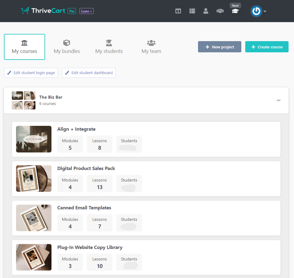
I like how this is organized, giving me a snapshot of all the digital products I have, including a reminder of the modules, lessons, and students enrolled. The “bundles” tab obviously shows the bundles I’ve created. The “students” tab is a list of all students enrolled in a product or course. And my “team” would show other instructors and collaborators here, although mine is empty because I’m the sole instructor within my shop.
All of my courses fall under the same “project” organization within ThriveCart Learn+, which works for me. This is categorized as The Biz Bar because that’s the name of my digital product shop.
Best course platform ThriveCart Learn+ Review: Student dashboard
For customers, the dashboard looks like any other course platform. Here’s what it looks like when you log into the main course dashboard. Customers see a view of all the courses and digital products they’ve purchased. If you’ve purchased 1 digital product, you’ll only see that 1. If you’ve grabbed multiples from the same educator, you’ll see all of your active enrollments on this dashboard. As the shop owner, I see all active products and courses in my preview.
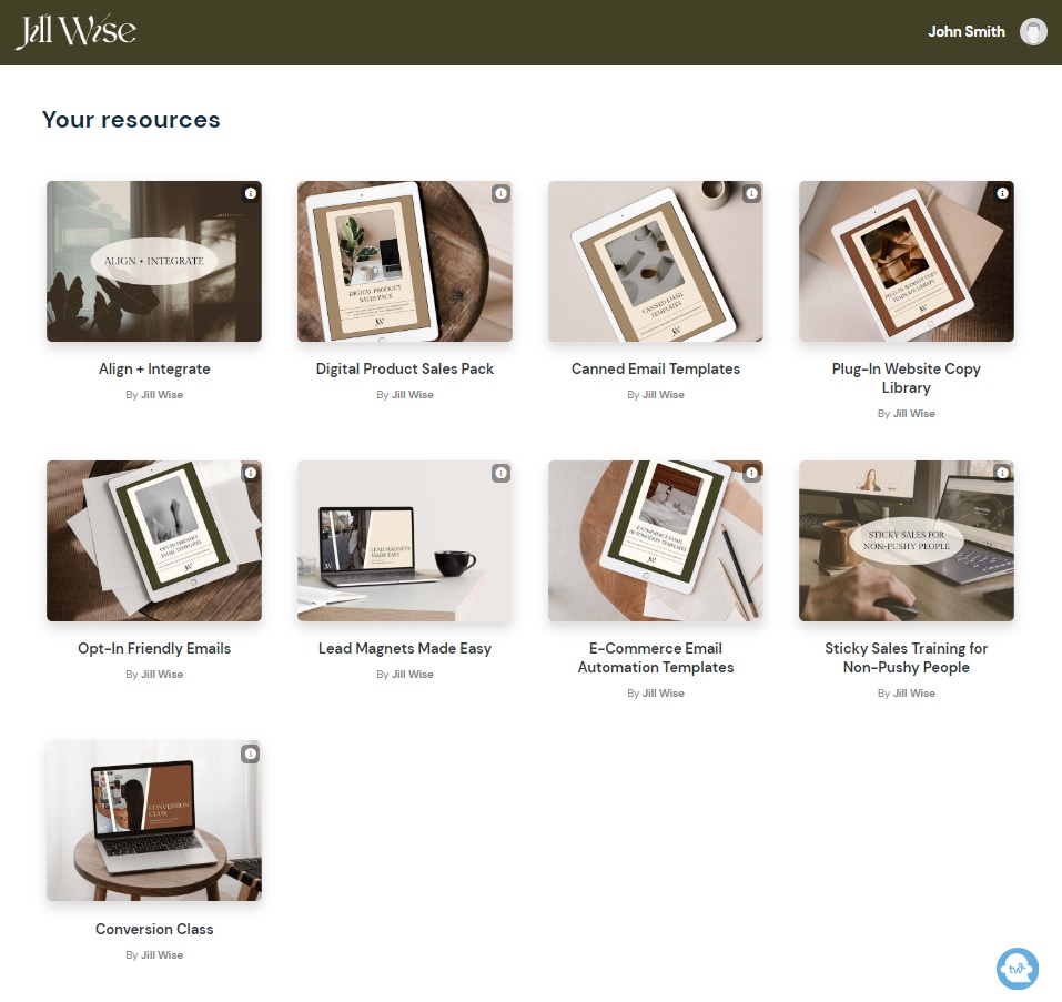
Next, when you click on an individual product, the customer view looks like this…
This is one of the products in my shop that would be the most beneficial for new digital product creators. It includes everything you need to get your marketing copy ready to launch. You can check out the Digital Product Sales Pack here.
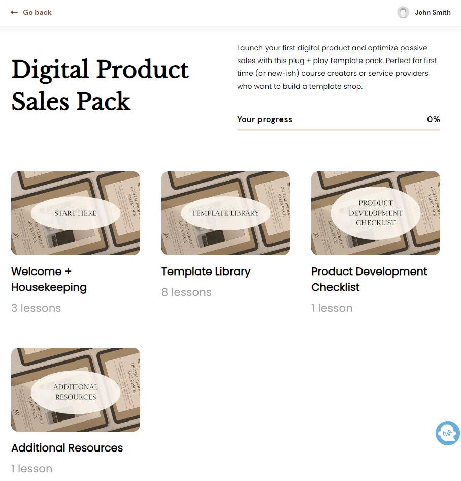
When you click on an individual tile or “module,” the view looks like this. I think this tile view works best for my digital products that have multiple different types of tools. For example, you can see this entire module is actually a template library. Another module inside the same course is the welcome and housekeeping information, like how to use the templates. And another holds the product bonus resources.
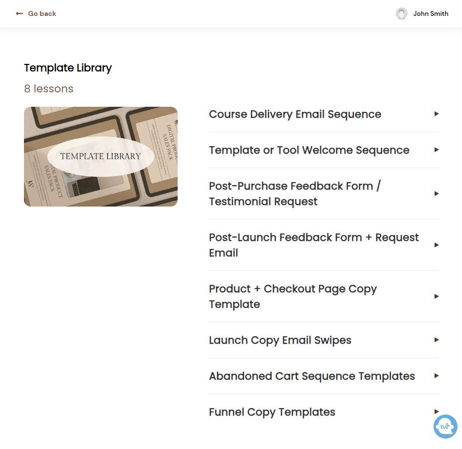
This example specifically is a massive template pack! Not all of my digital products include as many template categories, so this module would look a little different.
I typically try to arrange digital products that are templates like this: Based on the template type. Then each individual lesson gives an overview of that category of template. I share a lesson view below!
Best course platform ThriveCart Learn+ Review: Course builder
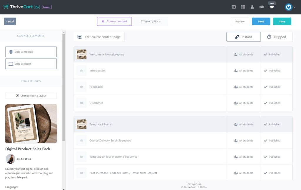
The backend of the course builder on ThriveCart Learn+ is easy to use… Especially if you’re not very techy or not a designer. It’s drag and drop for everything. You plug in the product name, images like thumbnails, description, etc. Then you can easily duplicate lessons if you follow my suggestion of creating a single template for your projects to follow.
This is what it looks like inside a specific course or digital product setup space. Because I use the templated method to setup each product every time I create a new product, I can copy my template course and just use that to plug the new content into with all the settings, organization, and layout how I like it.
Best course platform ThriveCart Learn+ Review: Lesson view
I promised a lesson view! I’ll show you a few different perspectives of this view inside ThriveCart Learn+ for both the course and product creator, as well as the customer.
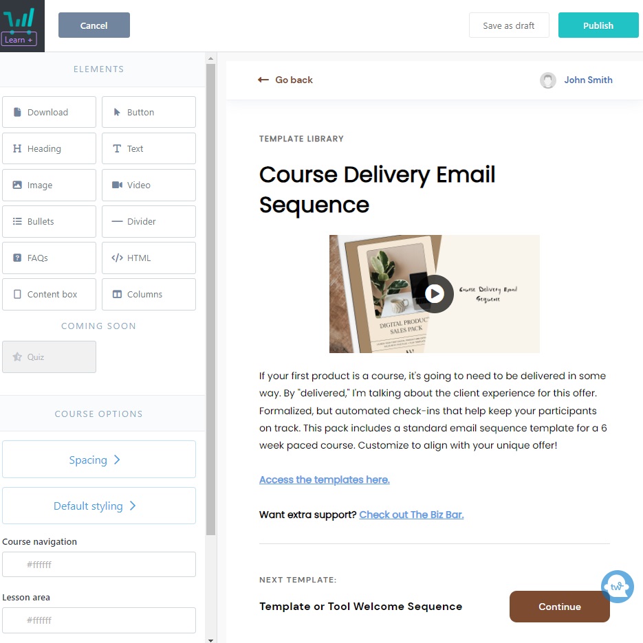
Here’s what a lesson looks like inside the course builder. You’ll notice the drag and drop builder features within simple boxes. Even the least techy person could use this.
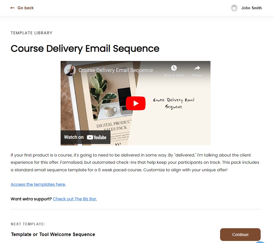
And here’s what a lesson looks like for a customer. Clean and simple… Just like most other course platform options out there. I’ve set up each of my product lessons to typically include a video walk through or tutorial, link to the attached resources, and a prompt to get extra support from the shop. All of this content is ready to go prior to building. I just upload, add my brand colours and a thumbnail for the video, and all is ready to go.
These images are from the same lesson, which is a lesson inside the Digital Product Sales Pack. It includes email templates for digital product delivery sequences and course delivery sequences. More on why these are important for your digital product setup below!
This is why I’m so adamant that ThriveCart Learn+ is the best course platform. It looks the same, functions the same, and costs way less as a digital product or course creator. Like why NOT use it? It might sound like I’m just talking about the positives at this point, but I genuinely haven’t found a reason to dislike the platform yet.
Best course platform ThriveCart Learn+ Review: Checkout and fulfillment connection
Arguably my favourite feature about ThriveCart Learn+ is the fact that they started as an amazing checkout option. As a Canadian business, I’m required to charge sales tax to other Canadians. The amount of that sales tax is location-specific, and based on the location of the customer. As you may have discovered if you’re also Canadian (or from somewhere with similar rules)… That complicates things.
With other checkout and course platform options, it was impossible to charge sales tax based on location natively within the platform. For example, Thinkific couldn’t automatically calculate and collect location-based sales tax at the checkout. So even though I was using that course platform, I had to look at integrating another tech tool for my checkout.
I looked at all the options and finally found ThriveCart. Again, I loved it because of the 1-time fee. While these other tools promised low fees, it was fee after fee. The checkout cost, then they charge a percentage of the sale, the course platform takes a cut, etc. etc… Then you still need a payment processor (like Stripe) which also takes a percentage of every dollar you earn. And bookkeeping/accounting tools that are recurring fees. All of those monthly expenses add up.
ThriveCart solved the sales tax problem by providing a checkout experience with location-based customizations… And it was just a 1-time fee.
Now, this is my favourite part of the migration to Learn+ because everything integrates in the same platform. Which means no more zaps or tech connections glitching. It’s easy.
All you need to do is select the correct product or course in the “fulfillment” tab of the product checkout setup. Then every customer is automatically enrolled on purchase.
2025 updates to checkout and fulfillment
On top of the smooth checkout and fulfillment setup, ThriveCart has also added more control over how subscription cancellations work.
For anyone selling in the EU, the platform now meets the new “click-to-cancel” compliance requirements, which means your business stays on the right side of regulations without you needing to set anything up manually. And if you’re on Pro+ with Stripe Connect+, you can manage cancellation settings at the product level. This gives you the flexibility to allow easy self-cancellations on some products while keeping manual control over others.
Best course platform ThriveCart Learn+ Review: Email delivery integration
Another reason why I love ThriveCart and Learn+ is that it talks directly to ActiveCampaign, which is the email automation platform I’ve used for years. This also eliminates the need for zaps! And while Zapier is a solid option if you need something like that, it still glitches. There’s always going to be something when there’s additional steps to account for. So by eliminating the extra tool talking between things, it minimizes the opportunity for errors.
For all of my digital products and courses, when someone makes a purchase they are emailed their access and delivery via ActiveCampaign. I’ve setup entire robust automations within the platform based on their purchases. These are segmented to align with specific bundles, individual products, whether or not they are return customers, and more.
If you haven’t considered automating your delivery sequences via email, I highly recommend this step. There are templates for this along with abandoned cart automations inside the Digital Product Sales Pack.

Why choose ThriveCart checkout?
When you start selling digital products, you may need to set up a different payment processor. I did a ton of research on this and tried a few platforms over the years.
Ultimately, I settled on (and love) ThriveCart because of the 1-time payment and location-based sales tax capabilities. These features lower my monthly recurring expenses and eliminate the headache of manually calculating (and remitting, therefore eating) the sales tax for specific customers.
For my fellow Canadian digital product sellers, you need to pay attention to location-specific sales tax. If not immediately when you start your business, you will need to figure this out soon because the revenue threshold varies from province to province.
I also like that ThriveCart’s checkout is highly customizable in terms of checkout design, the fulfillment page, and more. It talks seamlessly to my email marketing platform (ActiveCampaign) for the attached product delivery sequences. And now, my product hosting platform is built in so it’s all in one place—even easier for me to manage.
Best tech to create and sell digital products
If you’re looking for suggestions across the board for the best tech tools to create and sell digital products, you can see my most up to date recommendations here. This list is updated regularly with the tech tools that I’m using in my business currently. I wouldn’t recommend anything that I don’t personally love!
I keep this list of tools up to date as my business grows, and ThriveCart continues to stay at the top for me. With the latest August 2025 updates—like smarter subscription metrics, flexible course access, and product-level cancellation controls—it’s still my number one recommendation for course creators and digital product sellers who want a reliable, all-in-one solution without piling on monthly fees.
Prioritize your offer over the platform
Remember that what’s more important than the platform you choose is the offer itself. If that’s good, it won’t matter as much where or how it’s hosted. YES, of course presentation and customer experience matters. But you need to create a valuable digital product before any of that is relevant.
I hope you found this tour helpful! If you have any questions about creating or selling digital products, please leave them in the comments below. I’m happy to revisit this conversation.
*This post contains affiliate links, which means that if you choose to follow my recommendations, I make a small commission at no additional cost to you.

ThriveCart Learn+ FAQs
Is ThriveCart Learn+ good for beginners?
Yes. ThriveCart Learn+ is one of the easiest course platforms to set up. Even if you’ve never sold a digital product before, you can create a simple, professional course or shop in just a few hours.
What types of products can I sell with ThriveCart Learn+?
You can sell online courses, digital downloads, memberships, and bundles. I use it for my entire digital product shop, but it’s flexible enough to grow with you as you expand your offers.
How does ThriveCart Learn+ compare to platforms like Teachable or Kajabi?
ThriveCart Learn+ gives you the same polished student experience and creator tools, but it’s simpler and more affordable. Many people choose it because they don’t want to pay high recurring monthly fees just to host their products.
Do I need to be tech-savvy to use ThriveCart Learn+?
Not at all. The builder is drag-and-drop, so you don’t need design or coding skills. If you can upload files and copy-paste links, you can create a clean, professional-looking course.
Can I grow with ThriveCart Learn+ as my business scales?
Yes. You can start with a single product and later add more courses, bundles, or memberships. ThriveCart makes it easy to organize everything under one student dashboard, so customers can access all their purchases in one place.
Related
Leave a Reply Cancel reply
Leave your info below to join the list. I send a lot of emails because people love to read them.