


How to send marketing emails people read
If you’re just getting started with email marketing, my guess is you have questions. Lots of them. As a marketing consultant who’s written, overseen, and sent tens of thousands of emails for clients and my own brand, I know what works (and what doesn’t) right now. Since you’re here to learn, I have a library of copywriting, and more specifically, email marketing resources for you. This post is your go-to guide for email marketing format best practices—copy, design, and strategy.
Aka, how to send emails that people actually read.
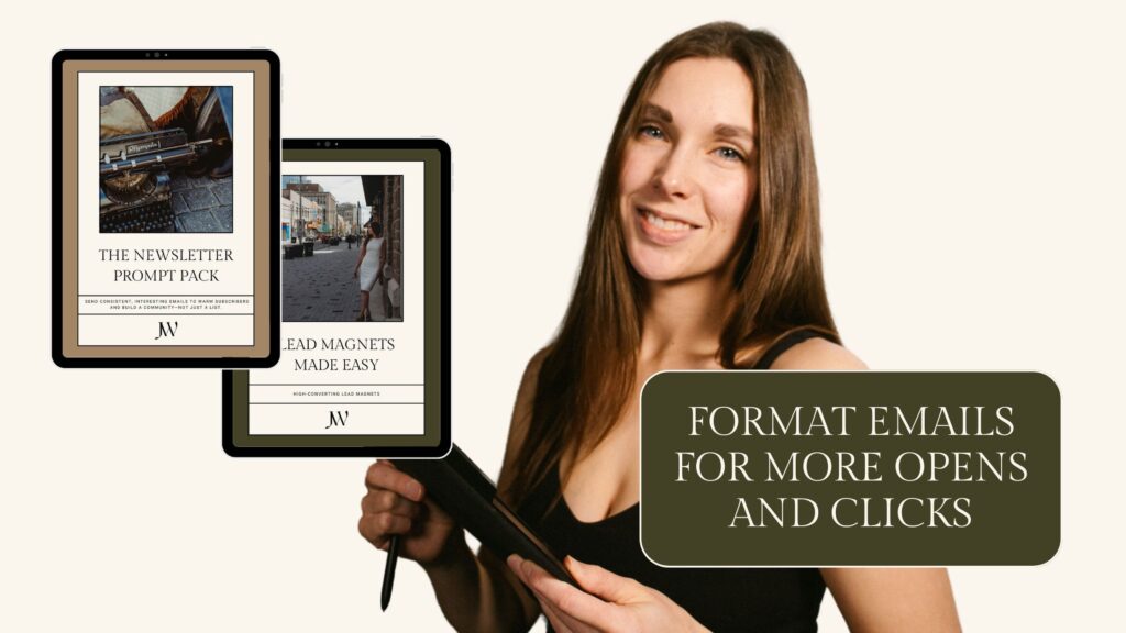
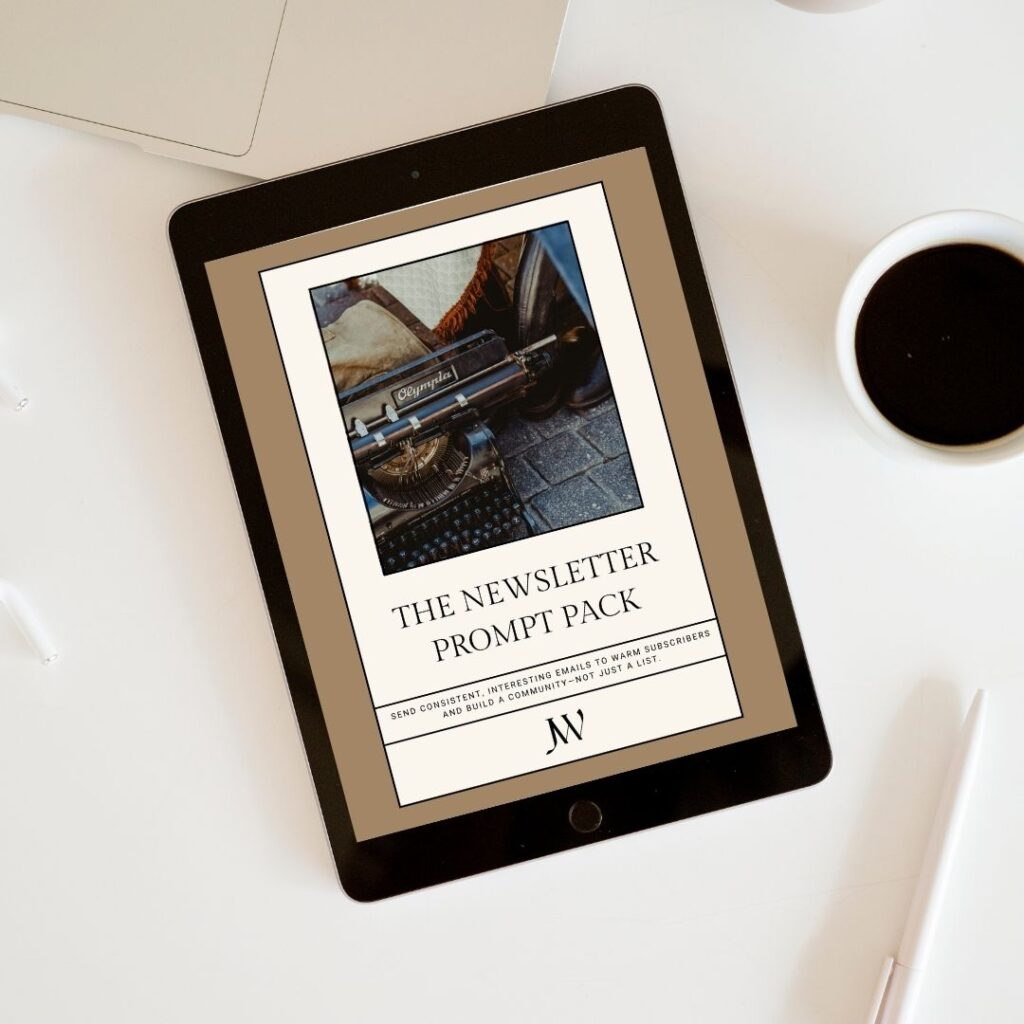
✨ To take immediate action and send better, more engaging emails to your list, check out The Newsletter Prompt Pack. This free download includes 52 newsletter prompts to help you write interesting marketing emails to your list in 30 minutes or less each week… Starting today if you want.
Why email marketing format matters in your email marketing strategy
When people talk about email marketing, they often focus on what to say. The content, the offer, the timing. But how you say it—the structure, layout, and formatting—can be the difference between someone actually reading your email… or deleting it before they even open it.
Or worse… They don’t even acknowledge it in their inbox, and their robo-assistant auto-deletes it from their promotions tab. Womp womp.
We’re all sinking in BS in our inboxes. At least those of us with busy businesses and full lives. Our attention spans are shorter than ever. Competition is getting stronger. We sign up for email lists and forget why or where. Honestly, this is an exciting time to start email marketing because things are different lately compared to years prior.
Strategically experiment with your email marketing
We get to be creative, try things, and find ways to connect with people beyond the noise.
Email marketing formatting is a quick win in your email marketing strategy. If your emails feel dense, cluttered, off-brand, or hard to skim, even your most loyal subscribers might click away. Your (fun!) challenge is to arrange your thoughts in a way that is easy for people to read and remember.
That’s why formatting matters. Not just for aesthetic reasons, but for readability, engagement, and conversions. Good email marketing format helps your message land faster. More clear. It removes friction. It gently guides someone to the link you want them to click or the idea you want to stick.
And this isn’t just theory. I’ve been a marketing consultant for years, which means that I’ve written and sent tens of thousands of marketing emails for myself and for clients across different industries. Over this time, I’ve tested different styles, formats, lengths, visuals, and CTAs. I’ve seen how much a small structural tweak can improve overall campaign performance.
Formatting isn’t fluff. It’s strategic. And it deserves consideration in your email marketing plan.
The anatomy of email marketing emails that work
If you haven’t bookmarked this blog post yet, do it now. Especially this section—it’s basically your cheatsheet for email marketing format best practices. These are the pieces that make an email not just “good,” but readable, engaging, and actionable.
Let’s break it down into each section of your email.
Subject line and preview text to increase opens
Before anyone can read your beautifully stylized and action-inspiring email, they have to open it. So your subject line and preview text need to do the heavy lifting.
You need to create curiosity, but stay clear and on-brand. No one likes bait-and-switch or unbelievable promises. Just enough interest to give people a reason to click, while matching with the copy inside.
👉 Should you be clever or direct? That old copywriter debate still rages on too many LinkedIn posts… but the real answer? Know your audience. Some people love wit. Others want straight shooting. Try both. Test and learn. You need to know who your audience is and what they resonate with to determine how clever you can be. Your audience will always decide what works best, and you can track those decisions through their behaviour.
Header and branding to build authority
Your email header isn’t just a nice to have decoration. It’s your brand doing what it’s supposed to do: Make your content memorable. A consistent header with your logo, brand colors, and a clean layout helps people recognize you right away.
Make it easy to read on desktop and mobile. Stick to minimal design and avoid anything too flashy (or spammy) to keep the deliverability gods happy.
The big goal with anything branding is to feel familiar for your audience. You want people to feel like they know you, and consistent visuals will help that. They’ll start to recognize your vibe. More tactically within an individual marketing email, the intent is also to give hierarchy to the important stuff in your message.
Personalization and personality to connect
Adding “Hey {first name}” to the start of your email is fine, but that’s the bare minimum. Personalization is about making it feel like a real conversation, not a mass email blast. How do you do that?
👉 Speak to one person when you write, and write about stuff that makes them think in a new way, feel something, or make a decision. Email marketing is intimate. People check their emails before they get out of bed some days.
👉 Understand their stage of awareness, and write to that. It’s up to you to meet them where they are in their buying journey. A welcome sequence email should feel different from your weekly Friday recap. One’s an intro. The other is a catch-up. Each hits at a different stage of awareness, building your relationship with them.
👉 If your email marketing tools allow, personalize the messaging within your emails. For example, I have personalized sales segments that trigger based on subscriber behaviour and interactions with my web pages. More on that here.
On top of personalizing for your reader, you need to layer in your brand personality throughout. Write like you talk. Keep it human (even if you have ChatGPT help you write your emails). Don’t censor yourself to be likeable if what you have to say is relevant. People will like the real you, or your authentic brand voice.
Body copy structure to engage readers
A typical email structure looks like this: Hook → Message → CTA
There are different email marketing formats and copywriting formulas you can use depending on the intent of your email. But first, you need to know the intent. Do you want this email to sell or nurture? Educate or inspire? A combination of the above?
Often, you’ll want to keep your email marketing emails heavy on stories. Stories sell. If not in this specific email, they set up the sale for later with seeds of trust and connection now.
However, stories don’t always need to be long. Shorter copy can be harder to write too because it forces you to kill the darlings, or anything not relevant to the main point. Try different email marketing formats to see what works best for you.
Email layout and design for readability
Design doesn’t need to be fancy to be effective. In fact, simpler is often better when it comes to email marketing format. Your goal is to make your message as easy to read, and act on, as possible.
There’s a common copywriting principle called the Rule of One: one goal, one message, one reader, one call to action. You only need one of each in each piece of content. This rule exists for a reason. One of the biggest mistakes I see is email marketers and business owners who DIY their email marketing trying to cram too much into a single email. A promo, a personal story, a testimonial, five different links… It’s overwhelming.
And confused people don’t buy.
Instead, simplify. Stick to font sizes that don’t require squinting (12–16pt is a good sweet spot). Use headers to guide your reader through the email. Create breathing room with white space so the content doesn’t feel crammed together.
When choosing your colours, use high contrast between text and background (no gray-on-white or pastel-on-pastel). And absolutely make sure your emails look good on mobile. Send yourself a test and view it from your phone! A huge chunk of your readers are opening on their phones. Think: single-column layout, tap-friendly buttons, and big enough text to read while multitasking. Check your graphics with text are readable (these won’t resize or rearrange like copy will for screensize).
Continuing the rule of one into design, you can avoid clutter by sticking to one visual focal point and one clear CTA. Simplicity in your layout isn’t just about aesthetics—it directly affects the results of your email marketing strategy.
Keep your email marketing format simple
Something to keep in mind: you don’t need to squeeze every learning or connection into a single send. One story can be stretched across multiple emails—each one delivering a focused takeaway, building connection, and moving your reader forward. That’s a smarter strategy than trying to do it all at once. Way more efficient for you too!
💡 Want a shortcut to writing marketing emails people actually look for in their inbox?
Grab my Newsletter Prompt Pack… 52 tried and loved prompts designed to help you send consistently good emails without stressing about wtf to write this week because why would anyone care? They’ll care when they get emails written from these prompts.
Learn more about The Newsletter Prompt Pack here.
Email marketing emails with images vs no images?
My general take on this debate is this: If a visual supports your story, your brand, or the sale, then it belongs in the email. If you’re just adding images to check a design box or make your email “prettier,” it’s probably not serving a purpose.
Intentional visuals can absolutely elevate an email and make it more effective. Think: a screenshot that clarifies your point, a photo that helps your audience connect to your personal story, or a branded graphic that reinforces your offer. But if it’s just filler? Skip it.
There’s also a tech side to this.
Image-heavy or overly designed emails can trigger deliverability issues, especially if your balance between text and images is off. Some inboxes are quick to flag that kind of thing. If your emails are landing in spam or promotions, too many graphics might be part of the problem.
If you do use images, make sure you:
- Use ALT text so the context doesn’t disappear if the image doesn’t load.
- Include a plain text version of your email (most email platforms support this automatically, but it’s worth checking).
So don’t add visuals just to add them. Be strategic. Make your design choices with a purpose. The best email marketing format isn’t about “should I use images or not?” It’s about how you make every element of your email work for your message and your audience.
Write CTAs that get clicked
A great email doesn’t just get opened—it creates action. Obviously, you need a motivating CTA.
Since we’re talking about email marketing format, you might be wondering where to put the CTA. Or maybe you assumed it would always be at the end of the email. But no, there’s no one-size-fits-all rule. It depends on the structure of your email, the copywriting formula you’re using, your reader’s stage of awareness, and where this email fits in your overall campaign.
If someone already knows, likes, and trusts you, or they’ve been warned by previous emails in the sequence, you can try placing a CTA near the top. They may be ready. But if your email is doing more educating, storytelling, or objection-handling, the CTA might belong near the bottom after the context has been built.
That said, in longer emails, I like including one early CTA for skimmers and another toward the end for those who read it all. Just make sure they’re both pointing to the same action because one clear CTA per email converts better.
Generally, when you ask your reader to do multiple things (click this, buy that, watch this, reply here), you split their focus. There are of course exceptions to this rule. But for the most part, you want to keep that Rule of One going strong.
How do you format your CTA within your email marketing format?
Visually, you want your CTA to stand out. That could be:
- A bolded or underlined hyperlink.
- A button in your brand color and clear copy to click.
- A line break above and below to give it breathing room.
You also might try testing a hidden link (hyperlinked plain text) versus a button to see what works better for you.
Just don’t overdo it. If everything is bold and bright, nothing stands out.
Overall, write CTAs like you’re holding your reader’s hand and showing them where to go. Make it clear, make it actionable, and place it where they’re most ready to click.
Email marketing templates and tools to make it easier
Email marketing is so much simpler (and faster) when you’re not reinventing the wheel every time you sit down to write.
I love a good template. I sell a whole library of them inside The Biz Bar, from welcome sequences to digital product funnels to delivery emails and beyond. Templates are the hack to sending consistent, strategic email marketing that doesn’t eat up all your time (which is also why I love my Newsletter Prompt Pack).
Winging it slows you down and leads to scattered results. A high-converting template helps you start with some email marketing format strategy baked in. You can plug in your message, tweak it to your brand voice, and hit send without remembering all the formatting details you want to use.
Most email marketing platforms let you save your own templates, too. I have different ones saved for different types of emails—like sales funnel emails, delivery emails, and regular newsletter formats. Each one is styled with my branding and designed for clarity, readability, and conversion. They all match stylistically, but serve different purposes and follow nuanced strategies.
If you’re building your own email marketing templates, here are a few tips:
- Keep the formatting simple and clean.
- Use consistent fonts, colors, and spacing.
- Include room for your CTA, branding, and any personalization.
- Skip excessive graphics or clutter that distracts from the message.
- Standardize the details like margins and font sizes.
- Make logos and signoffs the same.
There are also email marketing tools that can help you create templates like:
- Your ESP’s built-in template builder (ActiveCampaign’s is powerful).
- Canva for simple on-brand images or header graphics.
- Grammarly or Hemingway to tighten your copy before it goes out.
Email marketing platform suggestion
If you haven’t chosen an email marketing platform yet, ActiveCampaign is my #1 recommended email marketing and automation tool. It’s a bit of a learning curve, but is worth the more in-depth setup for the robust features available. I always suggest this option to course creators and digital product sellers, but other business types as well.
New to email marketing? Here’s how to create an email list from scratch
This post covers list setup, opt-in forms, and the foundations of list growth… Like beginner-friendly ways to get your first subscribers. If you’re new to email marketing, start here:
👉 How to Create an Email List
Planning your weekly newsletter? Keep your email marketing strategy simple to start.
If you’ve never tried (or consistently succeeded) with email marketing before, keep your strategy simple to start. You can always add more in, but if you try more than you can reasonably accomplish, you’ll probably just give up.
Most importantly, don’t stress yourself out trying to make each weekly newsletter amazing compared to the last. You don’t need to reinvent the wheel each week. Use a repeatable email marketing format and a consistent writing tone.
Still not sure what to send? This post has your back:
👉 What to Send in Your Newsletter Each Week
Build and launch a lead magnet that gets signups
If you want people on your email list, you need to give them a reason to sign up.
Enter: The lead magnet.
Some people call this a “freebie,” but I think it’s important to sell your lead magnet from the perspective of real value. It’s not just a free thing. It’s a legitimate mini offer.
A strong lead magnet is one of the fastest ways to grow your email list, especially when it’s positioned, formatted, and delivered well. It taps into the rules of reciprocity, which basically means that if you give something valuable first, people are more likely to stick around and buy later. And when done right, your lead magnet doesn’t just get signups… it qualifies future buyers.
Here’s the part a lot of people skip: The delivery of your lead magnet supported by your email marketing strategy. This sets up your relationship with a new subscriber from the moment they get to your landing page, either via organic content or paid ads.
So to do this well, you need…
- A confirmation page that reinforces value (and builds next-step momentum).
- An engaging well-formatted welcome email that delivers your lead magnet and shows subscribers what they can expect from hanging out with you.
- A follow-up sequence that continues to connect and convert.
First impressions matter. If your formatting is cluttered, confusing, or underwhelming in those first few emails, people will unsubscribe wondering why they even ended up here in the first place.
Tripwires and lead magnet support options
You can even add a tripwire offer to your confirmation page if you create a lead magnet. A tripwire is a low-priced, high-value product that helps recoup ad spend or simply moves someone from lead to customer faster. It’s one of my favorite low-lift strategies to boost sales and qualify leads at the same time. Customers are likely to repeat their behaviour if you give them valuable stuff.
If you’re stuck on what to offer or how to launch it, grab Lead Magnets Made Easy. This is my guided resource to help you build a freebie your audience actually wants and set it up with strategy from day one.
Common email marketing format mistakes (and how to avoid them)
Still here? This is your rapid-fire email marketing format mistakes.
👉 Dense text blocks that overwhelm the reader
→ Break your copy into short, scannable paragraphs with plenty of white space.
👉 Too many visuals that distract from the message
→ Only use images when they enhance the story, support the brand, or lead to the CTA.
👉 Inconsistent branding across emails
→ Use branded templates for consistent fonts, colors, tone, and structure.
👉 Trying to squeeze too many stories into one email
→ Stick to one clear idea per email — split longer stories into a series if needed.
👉 Multiple CTAs fighting for attention
→ Choose one main CTA per email to increase clarity and conversions.
👉 Sporadic email frequency that breaks trust
→ Maintain a consistent cadence that your audience can rely on.
👉 Emails that feel vague, jumbled, or unclear
→ Follow a clear copy structure to guide readers from start to CTA smoothly.
👉 No clear messaging strategy guiding your content
→ Anchor your emails in your bigger marketing strategy to stay focused and intentional.
👉 Ignoring mobile optimization
→ Design for mobile first — keep layouts clean and test on different screen sizes.
👉 CTAs that blend in or get buried
→ Use visual cues like bolding, buttons, and strategic placement to make CTAs pop.
👉 Using brand-preferred language instead of voice-of-customer data
→ Mirror the words your audience actually uses to increase relatability and trust.
👉 Too broad segmentation or lack of personalization
→ Get more specific with your email segments to deliver the right message to the right people.
Test and optimize with simple tweaks that mix up your email marketing format
Above all else, test your email marketing strategy. Then test again. Your audience will tell you what works. Behaviour is language… If you’re paying attention.
Try This: Strategic Email Formatting Experiments
Here are 7 quick experiments to try:
- Test long vs. short emails
→ Use longer emails for storytelling, education, or unpacking big ideas. Try short ones for punchy tips or curiosity-driven links. - Try hidden, mysterious links
→ Instead of always explaining where a link leads, spark curiosity with phrases like “try this” or “this might surprise you.” - Swap between CTA buttons and text links
→ See which drives more clicks—bold buttons or simple underlined links in your copy. - Play with subject line styles
→ Clever or clear? Personal or urgent? Test different approaches and track open rates to find your audience’s favorite flavor. - Break the pattern
→ If every email follows the same format, your audience may tune out. Surprise them with a totally different layout now and then. - Switch up placement
→ Try putting your CTA higher up for warmer leads, and deeper down for cold subscribers who need more context. - A/B test one thing at a time
→ Keep it clean: only change one variable at a time so you know exactly what moved the needle.
These small experiments help you understand what actually gets your emails opened, read, and clicked… And that’s where the magic happens.
Better email marketing format means better conversion rates
Yes, the details talked about here matter. Especially as you expand your business with an email marketing strategy, you’ll notice that the most impactful changes made come from tiny tweaks.
✅ Strong formatting = higher open rates
✅ Better formatting = more clicks
✅ Clear formatting = more conversions
It’s all connected.
Keep testing. Keep experimenting. Keep refining.
But above all? Write like a real human talking to another real human.
This isn’t just theory—it’s what I’ve learned from writing and sending tens of thousands of emails for both my brand and my clients. These insights are backed by real results, and they can absolutely work for you too.
Links to improve your email marketing emails
If you’re ready to write better email marketing emails faster, the Newsletter Prompt Pack is your next step. Apply what you just learned… without the guesswork of what to say, when and how. Learn more and get free access here.
Start your list with ActiveCampaign, which is my top tool for email marketing and automation. This 1 platform is responsible for about 50% of my operations when it comes to marketing, sales, delivery, and customer management.
TL;DR… Email Marketing Format Best Practices
🧠 Subject line & preview text: Spark curiosity and stay aligned with your brand voice.
📌 Header & branding: Keep it clean, consistent, and recognizable.
🗣️ Add personality: Make your email marketing emails feel personal and human.
📚 Structure: Use a clear flow like Hook → Message → CTA
🧾 Layout: One core message, one clear CTA, and plenty of white space.
🎨 Images: Only include visuals if they enhance your message (not just to fill space).
📈 Email marketing strategy: Focus on value and clarity… Not just what looks good.
🛠️ Try ActiveCampaign: My go-to recommendation for email marketing tools.
🧠 Need help writing emails? My Newsletter Prompt Pack can help you stay consistent.
✅ Best email marketing format? The one that works for your people.

